Following website design principles will help you to create a great website. A great website is one that:
- Is aesthetically pleasing
- Provides a satisfying user experience
- Helps the website owner achieve their goals
Read on to discover the 14 most important principles in web design – the ones I follow when designing my own websites.
Be aware that there is some overlap between the principles. Numbers 3, 6 and 10 may really surprise you!
Contents
- Clear purpose
- Deliberate visual hierarchy
- KISS
- White Space
- Mobile-Friendly
- Ignore the Rule of Thirds & the Golden Ratio
- Grid-Based Layouts
- Fast Loading Time
- Discerning Use of Visuals
- Consciously Crafted Colour Palettes
- Few Fonts That are Readable & On Brand
- Visual Cues to Direct Attention
- Follow an F-Shaped Pattern
- Content Organisation
Clear Purpose
The foundation of all web design principles is understanding the purpose of the website.
You should always start your web design process by clarifying the purpose of the website.
Every decision you make should support the purpose of the:
- Website in general
- Each page in particular.
For this to happen, you must be clear about what that purpose is. I’m talking about both the ultimate goal and the immediate goal of the site.
At a general level, this involves putting yourself in the shoes of both the website:
- Owner
- Users or website visitors
Answer questions like:
- What does the website owner want users who visit her site to do? Particularly their target audience.
- Why would people visit this site? What are users trying to achieve?
Then, repeat these questions for each individual page.
By keeping users in mind, you increase the usability of the site.
Deliberate Visual Hierarchy
In my experience, deliberately creating a hierarchy visually is the second most important of the website design principles in this list.
A visual hierarchy is the order in which website users are likely to notice different website elements. It is not about what the human eye sees but rather about what the human mind unconsciously perceives as being important.
You can deliberately influence the hierarchy with your choices about various visual elements on a web page.
You can do this several ways by making the most crucial element or elements (e.g., calls to action):
- Appear above the fold
- Have a contrasting colour
- Be larger than other elements
- Have additional white space around it
- Have eye gazes, lines or arrows pointing towards it
You Will Read This First
Then This
Then This
Many of these things are covered in more detail in the website design principles that follow.
But what is unique about the hierarchy is that it deliberately focuses on and highlights the most important aspect of the screen. And it influences what users click. You can spend a fortune getting visitors to your website with digital marketing, but it is a waste of time if they don’t convert. A visual hierarchy boosts conversions.
This is why the first web design principle is so important. There is an old maxim in design that form follows function. And crafting a visual hierarchy helps you create functional websites that are fit for purpose.
It is an essential aspect of effective web design (rather than merely creating a web design that looks good) for any site.
While you can make refinements to your site design along the way, you need to be thinking about the hierarchy at the start of your design process.
KISS – Keep It Standard & Simple
The acronym KISS sums up the next website design principle. A study by Google revealed that users prefer websites that are simple and have familiar layouts. So, in this context, KISS stands for Keep Things Standard & Simple to improve both usability and user experience.
Using Lorem Ipsum placeholder text is a great way to see the visual impact of layouts while waiting for content from clients.
Standard Layout
When I say standard, I refer to your site’s layout, not its content. According to research done by Orbit Media, standard website layouts have a:
- Logo in the top left
- Navigation bar within the header
Orbit media also found that common website conventions included placing your:
- Value proposition and call to action up high
- Contact link towards the top right
- Social media icons in the footer
This makes your website feel familiar to users.

Simple Website Navigation
Website navigation refers to those elements users click on or users interact with to find their way around your website.
Simple site navigation makes it easy for a user to find what they are after and move about your website.
It improves the usability of your website, which is a key aspect of UX design or user experience design.
Web design elements that are part of navigation include:
- The menu in the top navigation bar
- Breadcrumbs
- Buttons and internal links
- The footer
To simplify your site’s navigation, apply these real-world conventions:
- Limit the number of items in your top menu bar
- Try to avoid drop-down menus (or go with mega-menus)
- Use descriptive labels rather than generic terms
- Use breadcrumbs
- Ensure that visitors can get to what they want with three clicks or less
- Create a logical order within your site’s hierarchy
White Space or Negative Space
Good web design makes use of white space, which is why it is high on my list of web design principles. While quality content is crucial to a good website, so is the space between it. White space or negative space is the area between other visual elements, including:
- Letters, words, lines, paragraphs (Micro)
- Page margins and content, as well as sections of content (Macro)
- Everything in between

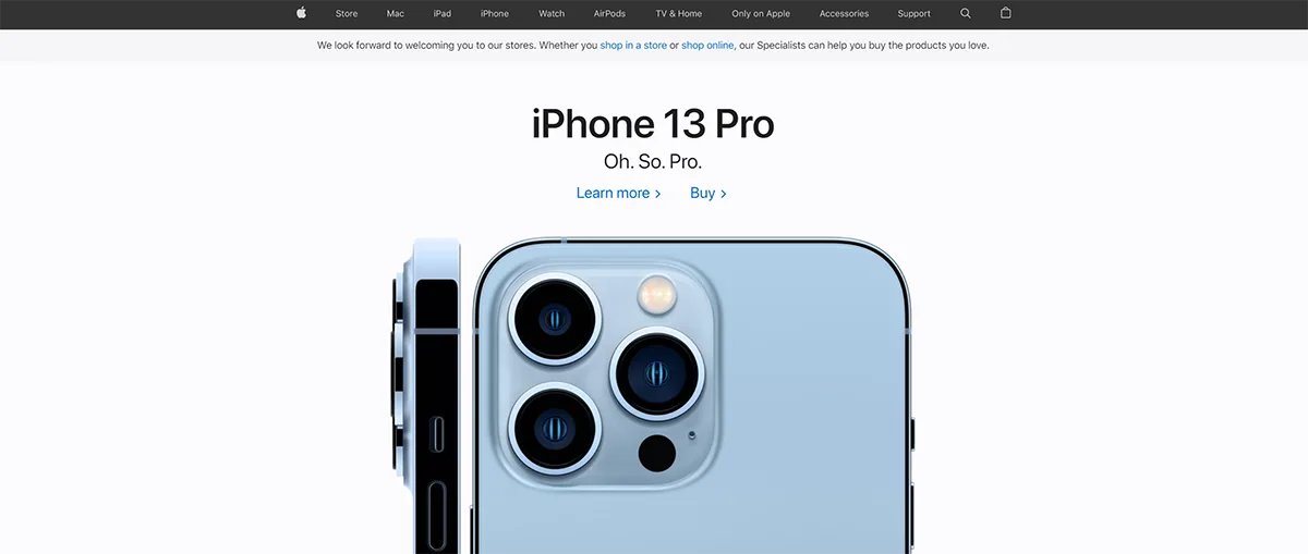
Apple’s website homepage is a good example of the principle of white space.
White space also emanates style and elegance.
Good designers make effective use of white space.
The opposite of white space is having too many elements close together, leading to:
- A cluttered look and feel
- Too much cognitive effort and cognitive overload for site users
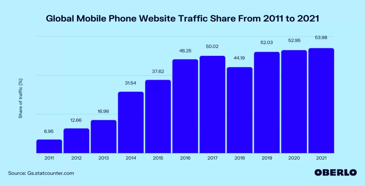
Mobile-Friendly Design
More and more people are using their phones to access the internet. This trend is even more prominent when users are looking up local businesses. So having a mobile-friendly design is amongst the most important web design principles.
Yet, people generally hold their phones vertically. So, you need to make sure your design looks good vertically. This has implications for your visual design process. You need to ensure you create a mobile-friendly design so that users have a great mobile experience.
Specific actions you can take to help you with your mobile design include:
- Choosing a theme that is both responsive and lets you tailor mobile settings (e.g., GeneratePress)
- Changing your padding on mobile devices to about 20 px
- Adjusting the size of your headings on mobile phones
- Making your body font small, but at least 16 pts
- Testing your pages on Google and real devices
Ignore the Rule of Thirds & Golden Ratio
Designers have been told that you should use either the rule of thirds or the divine ratio to position the central focal point of your layout. They are two of the most common web design principles on the internet and they have been standard guiding principles for quite some time.
Rule of Thirds
The rule of thirds involves taking a composition (e.g., a painting, a photograph, or the above the fold section of a webpage) and dividing it into three both:
- Vertically
- Horizontally
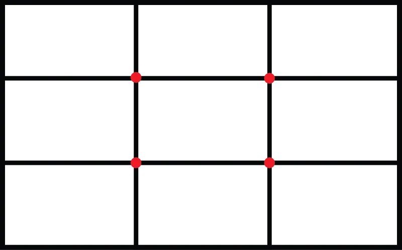
The rule of thirds suggests you should place your focal point along one of these lines or, even better, at one of the intersections.
The Golden Ratio
The golden ratio, also called divine proportion, suggests a slightly different position of your focal point. Without going into how to create it, you place this spiral over your composition. Then, you ensure that your focal point is in the centre of the spiral.

Lack of Evidence
Yet, I cannot find any robust evidence showing that using the rule of thirds or the golden ratio is better than other options.
I have found:
- Research revealing the rule of thirds is no more aesthetically pleasing than other arrangements
- A logical mathematical argument debunking the golden ratio
Does this mean that the rule of thirds or the golden ratio cannot lead to pleasing images or layouts? NO – definitely not. It just means they are no more likely to be pleasing than other arrangements.
Start with a Grid-Based Layout
To help you keep things neat, aligned, and professional-looking, you should use a grid to layout the visual elements on each web page across your entire project. This goes for experienced as well as new designers.
A grid is simply an intersecting pattern of columns and rows. Just as it is important to use fonts and colours consistently, it is important to have consistency within your layout.
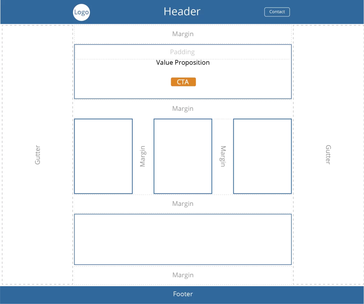
WordPress helps you to use grids easily with its block-based editor. Yet, you need to pay close attention to things such as:
- Margins
- Padding
- Vertical gaps
- Horizontal gaps
And you need to do this for:
- Computers
- Tablets
- Mobile phone
My favourite tool for working with grids is GenerateBlocks Pro.
You Can Deliberately Break the Rules
A grid is a great starting point. However, there will be times when you want to break free of this format to create a specific effect.
You can have:
- Grids within grids
- Grids over grids
- Shapes over grids
Doing this well takes experience. But don’t be afraid to try. Using a grid to guide your layout is meant to help rather than constrain you.
Plan for Web Pages to Load Quickly
This may not sound like a web design principle. Yet, many of the choices you make as a web designer can slow down your website. But slow loading sites:
- Annoy users, affect bounce rates, and lower conversion rates
- Get ranked lower on Google
Why does Google care? Because it affects user experience!
This means making sure your web design does not make your website slower than any of Google’s page speed thresholds.
When it comes to speed, good web designers avoid:
- Page builders (e.g., Elementor & Divi)
- Bloated plugins (e.g., Jetpack, Contact Form 7)
- Sliders (except for real reasons such as photos of a house for sale)
On the flip side, good web designers:
- Customise a well-coded, fast theme such as GeneratePress
- Only use plugins that contribute to the website’s purpose
- Optimise images (resize, WebP, compress if needed)
- Only use 1-3 fonts and load them locally
For more ideas, see my article 27 Potent & Practical Tactics to Speed up WP Websites
Discerning Use of Visuals
We are a visual species, and a picture paints a thousand words. Pictures or visual elements include:
- Photos
- Diagrams and charts
- Icons
Photos
Where possible, make use of original photos. But you will also need to make use of stock photos.
When using stock photos, use those that portray people realistically. Realistic photos give your site authenticity. How often do you really see business people in suits high-fiving each other?
You can get some good free photos at:
- Pixabay
- Pexels
- Unsplash
For paid stock photos, I recommend Adobe Stock.
Diagrams & Graphs
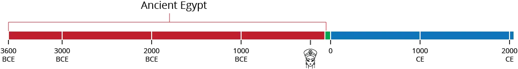
Diagrams and graphs can help your customers understand things more clearly than words alone. For example, did you know that there is less time between Cleopatra’s life and the present than between Cleopatra’s life and the start of the ancient Egyptian civilisation?
Icons
Icons are a key design element and can be an important part of the user interface. So, designers should consider using them in their web design projects.
Icons can concisely capture an idea or an action that a user can take. However, to do this well, icons must be easy to understand.
Some icons are universally understood, and these icons improve usability within your site. For example:
Yet, others can have more than one meaning:
It may be better to couple the icons with text for these icons.
I get icons from the Noun Project, which has a good range of icons.
Consciously Crafted Colour Palettes
Colours set the mood for your entire site, so they are essential to good website design and important enough to make this list of effective web design principles.
Your colour palette should:
- Reflect your brand personality or brand identity
- Include colours that work well together
- Help build your visual hierarchy
It would be best if you used it consistently across your site design, no matter what colour scheme you choose.
Popular Colours
According to research by Joe Hallock, blue is the most popular colour amongst both men and women.
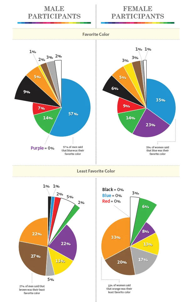
For men, this is followed by:
- Green
- Red
For women, blue was followed by:
- Purple
- Green
- Red
Yet, popularity is only one consideration. You also need to consider:
- What sentiments different colours evoke
- Which of these sentiments suit your brand
Colours & Sentiments
As you can see from the above graph, orange is one of people’s least favourite colours. And, in the graph below, you can see that people also associate it with the notion of cheap. Yet, the same research revealed that it was one of the colours commonly associated with fun.
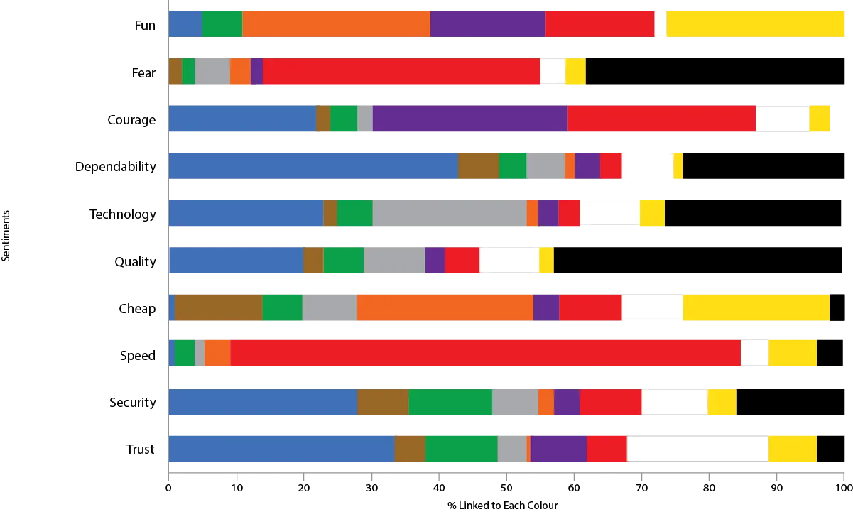
Except for fun and speed, blue once again faired very well.
From a Single Colour to a Color Scheme
For ease of reading, most websites use black (text) and white (background) for the bulk of their site. If not, they are likely to use very dark colours for the text and a very light colour for the background.
This doesn’t change much regardless of the main colour you choose. You can make limited use of dark backgrounds with white text but use this sparingly.
What changes is the colours that go with your main brand colour (complementary colour palette)? Your colour scheme should include a:
- Up to 3 variations of your dominant (shades, analogous, monochromatic)
- A contrast colour (complementary) for calls to action that pops on the page
Too many colours distract users. Not counting black and white, 3-4 colours is plenty.
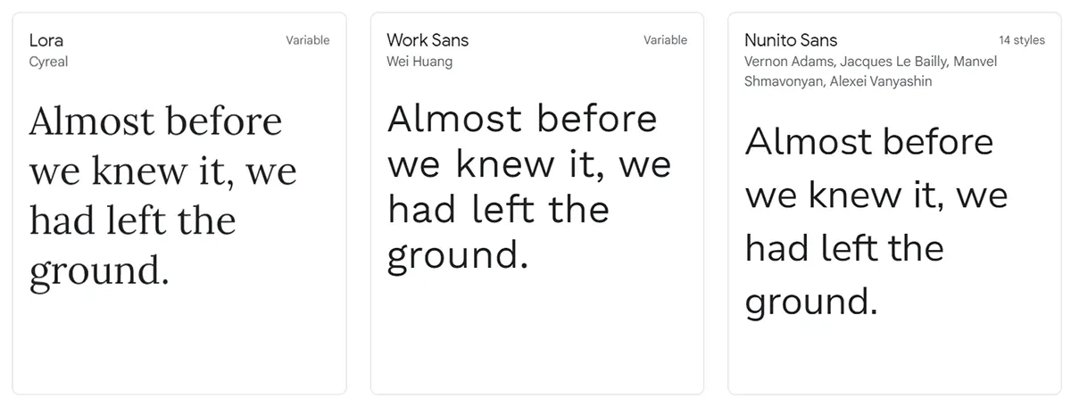
Fonts
When considering fonts for your web design project, readability must be the first consideration. This means that:
- The colour contrasts with the background
- The size is legible (16 on mobile, 18 on computer)
- Limited if any use of script fonts
In terms of style, your most basic choice is to select a:
- Serif font (e.g., Times New Roman) – can be seen as more traditional
- Sans Serif Font (e.g., Calibri) – can be seen as more modern
- A combination (e.g., one for headings and one for body text)
Yet, it is about personal preference. Research shows that neither serif nor sans serif fonts are superior.
Google has a wide variety of serif and sans serif fonts that you can use for free.
And, to avoid slowing down your website, you should:
- Only use 1-3 fonts
- Load your fonts locally
Visual Cues
Visual cues are unconscious signals that guide where visitors look on a web page. While they affect users unconsciously, designers use them deliberately as part of their web design process.
Research supports two types of visual cues:
- A photo of someone looking where you want the user to look
- An arrow pointing to where you want a user to look

Both have been proven to work. Yet, arrows are more effective.
Follow the F-Shaped Pattern
In some ways, following an f-shaped design pattern is the opposite of consciously creating a visual hierarchy.
Rather than influencing where your web users look, you place vital information where they naturally look.
Research by the Nielsen Norman Group revealed that when visitors arrive at a website, they tend to scan it in an f-shaped design:
- Headlines across the top
- Numbers, bullets, and tools down the left
- Sub-headings or bolded text from left-to-right again
Keeping the f-shaped layout in mind is an important principle in good web design.
Content
The written content aspect of content is largely down to compelling copyrighting.
But the placement and form of content are part of effective web design.
Make sure the information presented is presented in a user-friendly way. You place your most important offer and call to action above the fold. If visitors see the potential of your offer straight away, they are more likely to scroll down and read on.
As they scroll down, make use of:
- Headings and subheadings
- Bullet points
- Icons
- Buttons
Keep your paragraphs short (3 lines on a computer) and easy to read, especially on your home page.
Related: What Does a Web Designer Need to Know
A Quick Summary of Effective Web Design Principles
Remember that any design principle is only relevant when it:
- Is aesthetically pleasing
- Provides a satisfying user experience
- Helps the website owner achieve their goals
With these three guidelines in mind, good web designers use the following website design principles.
- Gain clarity about the purpose of the website, and keep this in mind with every decision you make about design
- Create a visual hierarchy that guides users’ eyes towards crucial elements on each page.
- Keep your layout and navigation simple and standard. This helps usability and, in turn, user experience.
- Use whitespace to separate key elements on each page and to make some elements stand out
- Make sure your site is mobile friendly. Ask yourself whether it looks good and is useable on a mobile phone.
- Ignore the Rule of Thirds & the Golden Ratio. This doesn’t mean don’t use them. Rather, it means you don’t need to use them.
- Start laying out your design elements using a grid. Then, use padding and margins to ensure everything aligns well.
- Avoid making decisions that slow down how quickly users see a web page. Rather, do things such as resizing media, using next-gen image formats, avoiding page builders, and loading fonts locally.
- A picture paints 1,000 words. But use realistic photos of people. Also, use graphs, diagrams, and icons to help people understand your points.
- Colour sets the mood for your site. Choose a colour scheme that your target audience likes that go well together and create the right associations in people’s minds.
- Serif and sans serif fonts are just as readable as each other. Choose a style and font that suits your brand. And limit yourself to a maximum of 3 fonts.
- Use visual cues, such as the direction a person is looking or arrows to guide users’ eyes towards where you want them to go.
- People naturally scan websites using an f-shaped pattern, so use this insight when positioning your important elements.
- Organise your content, so it is easy to scan using headings, subheadings, bullets, and white space.
Following these principles leads to both effective and efficient website design.
Website design principles provide guidelines for designers to create aesthetically pleasing websites, which provide a great user experience and help website owners achieve their goals.
