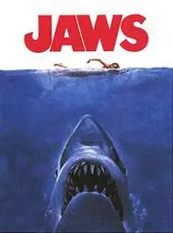
It’s a classic movie and a classic poster, so many people want to know, what font does Jaws use?
Why Do Fonts Matter?
This is because each character has a unique personality when it comes to fonts. Fonts can convey emotions, set the tone for a piece of text, and even influence how we perceive information. They are an important part of promotional posters as well as web design.
So, it’s only natural to wonder about the font used by one of the most iconic movie villains of all time – Jaws.
In this blog post, we’ll dive into the typography of the Jaws franchise and explore the font used in its iconic title.
The Infamous Jaws Movie Poster
The poster for Jaws is perhaps one of the world’s most recognised and parodied movie posters.
It features a simple yet spine-chilling image: a massive great white shark rising from the ocean’s depths toward an unsuspecting swimmer.
Above this striking visual, the movie’s title appears in a bold and distinctive font.

The Jaws Font: Amity Jack
Amity Jack is the brainchild of renowned graphic designer and typographer Samuel Dorian.
Born in the heart of New York City, Dorian’s passion for typography began at a young age. He drew inspiration from the city’s bustling streets and vibrant art scene, and it wasn’t long before he became a prominent figure in the world of graphic design.
Dorian’s journey to creating Amity Jack began when he was commissioned to design the poster for Steven Spielberg’s iconic 1975 film, “Jaws.”
With its suspenseful narrative and unforgettable shark imagery, the movie needed a font that could capture the audience’s attention and send shivers down their spine.
The name Amity Jack is a nod to the fictional town of Amity Island, where the film is set.
Dorian wanted a font that would convey both the coastal tranquillity and impending danger that the film portrayed.
A Display Font
Amity Jack is a display font. Display fonts are normally thicker than normal fonts, as they are designed to be used for titles and headlines.
Why the Amity TYPEFACE Works So Well
- Bold Simplicity: Amity Jack’s most striking feature is its bold simplicity. The font is characterized by thick, evenly-weighted letters that make a powerful visual statement. This boldness perfectly complements the poster’s ominous imagery of a colossal great white shark lurking beneath the water’s surface.
- All-Caps Precision: The font employs all capital letters, enhancing the impact of the title. The consistent letter size adds to the poster’s sense of uniformity and foreboding.
- Rounded Edges: While the letters are blocky and bold, Amity Jack has slightly rounded edges, providing a subtle contrast to the harsh, angular teeth of the movie’s antagonist. This softening effect is deliberate, maintaining the balance between danger and allure.
Lessons for Designers When Using Fonts
The Jaws movie poster with the Amity Jack font offers several valuable lessons about font choice for designers:
- Understanding Context is Key: The context of a design project plays a pivotal role in font selection. In the case of the Jaws poster, the font choice had to align with the movie’s themes of suspense, danger, and the ocean. Designers should carefully consider the message, tone, and emotions they want to convey when choosing a font.
- Simplicity Can Be Powerful: Amity Jack’s bold simplicity demonstrates that sometimes less is more. A straightforward font can make a strong visual impact, especially when paired with the right imagery. Designers should not overlook the power of simplicity in font choices, as it can enhance readability and convey a clear message.
- Consistency Matters: The use of all-capital letters in Amity Jack adds a sense of consistency and uniformity to the design. Designers should ensure that their chosen font aligns with the overall visual language of their project, whether it’s all-caps, lowercase, or a mix of both. Consistency in lettering contributes to a cohesive design.
- Attention to Detail: Samuel Dorian’s subtle variations and rounded edges in Amity Jack demonstrate the importance of paying attention to small details. These nuances can make a font unique and memorable. Designers should not be afraid to make minor adjustments to fonts to suit their specific project better while still maintaining readability.
- Balance Tradition and Modernity: Amity Jack successfully balances a classic, timeless aesthetic and a modern design sensibility. Designers can draw inspiration from this approach, recognising that fonts can be adapted and refreshed to meet contemporary design standards while preserving their essence.
- Legibility is Non-Negotiable: While Amity Jack adds an artistic flair to the Jaws poster, it remains highly legible. Designers should prioritise legibility in their font choices to ensure that the intended message is easily understood. Striking a balance between creativity and practicality is essential.
- Experimentation is Valuable: While it’s crucial to respect design conventions and best practices, the success of Amity Jack shows that designers should not be afraid to experiment and push boundaries in their font choices. Bold experimentation can lead to groundbreaking designs that leave a lasting impact.
The Legacy of Jaws and Its Typography
Jaws not only left an indelible mark on the world of cinema but also on popular culture.
Its poster, with the memorable Amity Jack title font, has been parodied and referenced countless times in various forms of media.
The image of the shark and the typography have become synonymous with suspense and terror.

